This autoplot() method plots performance metrics that have been ranked using
a metric. It can also run autoplot() on the individual results (per
wflow_id).
Arguments
- object
A
workflow_setwhose elements have results.- rank_metric
A character string for which metric should be used to rank the results. If none is given, the first metric in the metric set is used (after filtering by the
metricoption).- metric
A character vector for which metrics (apart from
rank_metric) to be included in the visualization.- id
A character string for what to plot. If a value of
"workflow_set"is used, the results of each model (and sub-model) are ordered and plotted. Alternatively, a value of the workflow set'swflow_idcan be given and theautoplot()method is executed on that workflow's results.- select_best
A logical; should the results only contain the numerically best submodel per workflow?
- std_errs
The number of standard errors to plot (if the standard error exists).
- type
The aesthetics with which to differentiate workflows. The default
"class"maps color to the model type and shape to the preprocessor type. The"workflow"option maps a color to each"wflow_id". This argument is ignored for values ofidother than"workflow_set".- ...
Other options to pass to
autoplot().
Details
This function is intended to produce a default plot to visualize helpful
information across all possible applications of a workflow set. A more
appropriate plot for your specific analysis can be created by
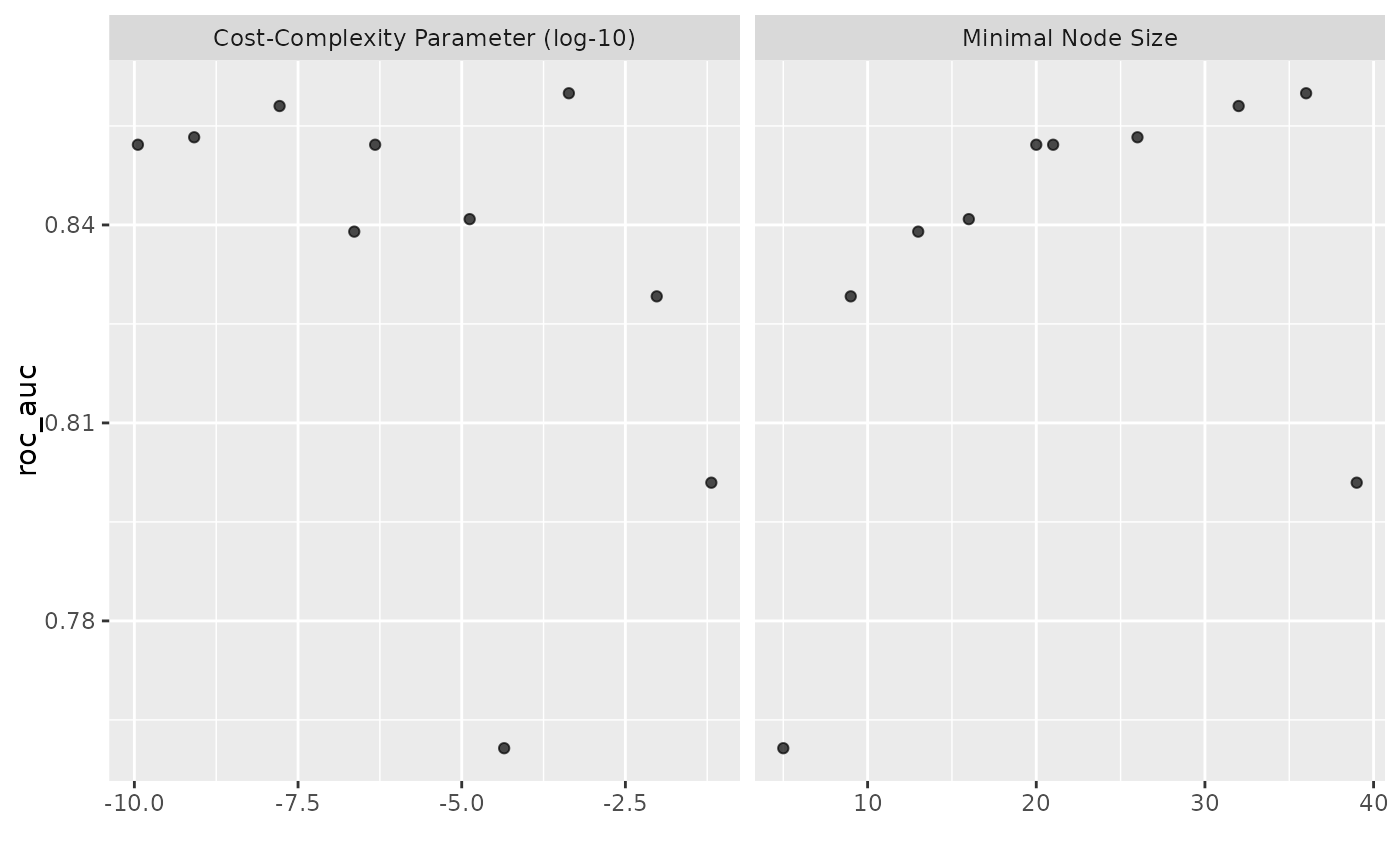
calling rank_results() and using standard ggplot2 code for plotting.
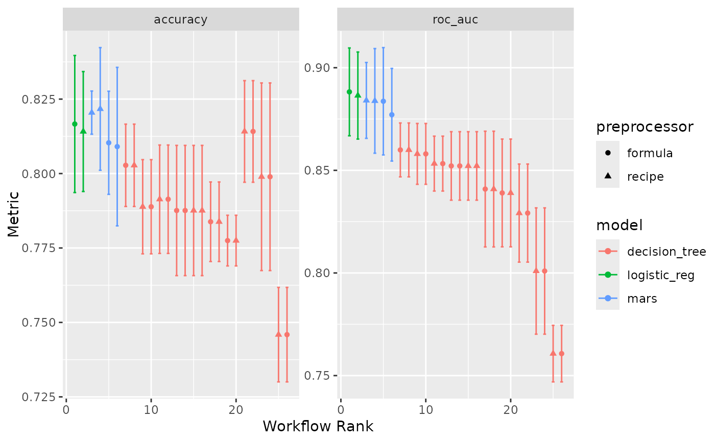
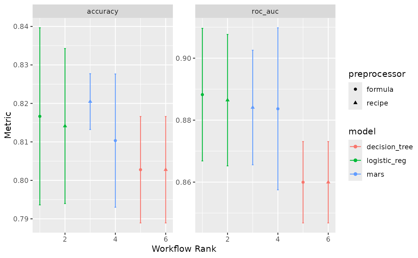
The x-axis is the workflow rank in the set (a value of one being the best) versus the performance metric(s) on the y-axis. With multiple metrics, there will be facets for each metric.
If multiple resamples are used, confidence bounds are shown for each result (90% confidence, by default).
Note
The package supplies two pre-generated workflow sets, two_class_set
and chi_features_set, and associated sets of model fits
two_class_res and chi_features_res.
The two_class_* objects are based on a binary classification problem
using the two_class_dat data from the modeldata package. The six
models utilize either a bare formula or a basic recipe utilizing
recipes::step_YeoJohnson() as a preprocessor, and a decision tree,
logistic regression, or MARS model specification. See ?two_class_set
for source code.
The chi_features_* objects are based on a regression problem using the
Chicago data from the modeldata package. Each of the three models
utilize a linear regression model specification, with three different
recipes of varying complexity. The objects are meant to approximate the
sequence of models built in Section 1.3 of Kuhn and Johnson (2019). See
?chi_features_set for source code.